
Venn Diagram
 Do you remember Venn diagrams? Seems they were always covered in the first chapter of my math and geometry textbooks in discussion of set theory. They are also used in language arts to illustrate overlapping concepts or relationships.
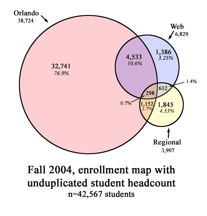
I had built this statistical one for work last week (click on graphic for larger version); it illustrates the distribution of student enrollments during one term here at UCF. The circles represent the areas of class types -- Orlando campus, regional campus, or web-based classes. The size of the circles are exactly proportional to the data. The overlap areas are a little off by necessity. I drew this graphic in Photoshop. As an information geek, I think its really cool. This will be used to assist higher ups with some funding and growth planning issues.
Categories: work related


2 Comments:
It is a cool diagram. Even I understood it. In the
East Orlando Times today President Hitt was quoted as saying that UCF had 45,??? students.He must have some new data.
DAD
I loved Venn diagrams when I was editing all those test prep books! I wasted too much time checking each one out -- all in the interest of "accuracy" of course. Don't know how I missed this post earlier this week. Max
Post a Comment
<< Home